Stacking the odds in our favour.
UX Strategy
Reading Time: 16 min
Year-long strategy to increase trial conversion and adoption rates by improving the UX of all customer touchpoints and fixing poor product communication. Made under the employment of Bricsys for the BricsCAD software platform.
I chose this work to showcase in my portfolio because it was the project that made me fall in love with and develop the strategic side of my expertise, and it gave me the opportunity to successfully lead the biggest cross-disciplinary initiative yet.
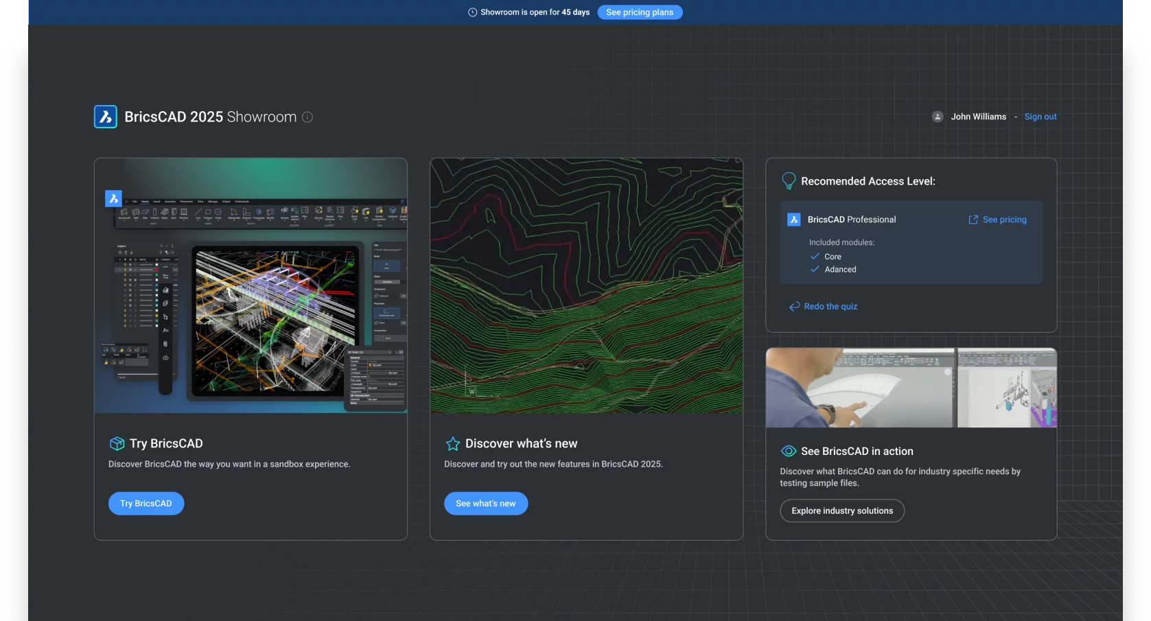
The Showroom. The proposed new trial experience. It aims to put the “best foot” forward and demonstrate to prospecting clients how BricsCAD can meet their needs. This embodies my strategy for the entire initiative perfectly.
Role
User Experience Strategist & Project Lead
Contributions
Product and UX Strategy, Prioritized Roadmap, Wireframes and Prototypes, Documentation.
Stakeholders & Collaborators
CEO, Head of Product, Head of R&D, Tech leads, Design Lead, Marketing Lead, Customer Success Team.
Timeframe
2022 - 2023Disclaimer
The actual events, processes and decisions recounted here did not occur in a linear orderly fashion - even though they read as if they did. As a professional I took a creative decision to share this process as a linear narrative because I find it is more interesting to read and easier to understand. I also took a creative decision to omit some technical details to appeal to any interested reader, not only those from a design background.
In over a decade of experience in the industry, I have never found any design or UX process that happens sequentially and linearly. Design has its constant twists and turns; it demands adaptability and creativity from everyone involved. My only goal is to transmit that same feeling into these work stories. - Santi
Goal & Challenges
During my time as Lead UX Designer, I noticed that the trial experience was missing the mark for our users, and thus not converting well. After Version 22 was released, this issue became more urgent as we discovered fewer users were upgrading their versions. This resulted in less revenue, so, as an organization, we aimed to turn this around and boost trial conversion and adoption rates. I started, naturally, by identifying the true source of these problems.
Present Santiago here: My intuition was telling me at the time that I could tackle both problems together, because I suspected they were related. I did not think they were about problem metrics, I thought it was about failure to persuade. Failure to properly communicate with the users. They were not picking up on what what we were putting out, if we were even putting something out. At the time, I did not have enough data to prove it so I set out to find it and validate or refute my intution.
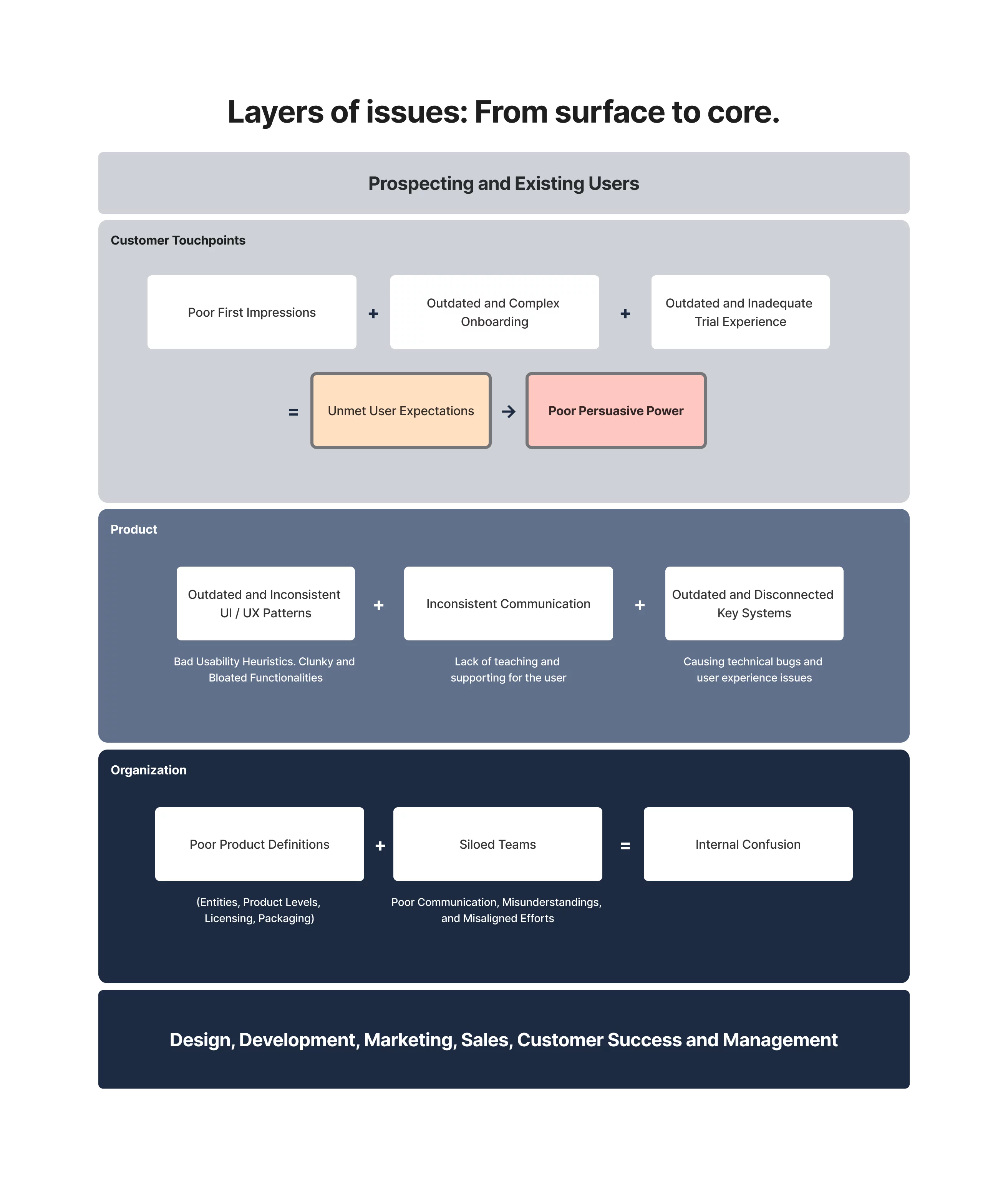
After reviewing years' worth of support tickets, watching recordings of users trialing the software, and conducting interviews, I identified three layers of issues.
At the core and closer to the organization, poor product definitions and hard-siloed teams led to widespread miscommunication, misunderstanding, and significant internal confusion. There was no clear agreement among teams about what was what. That, and a mixture of legacy items from different sources, created a nasty confusion about the overall product (things like entities, product levels, licensing, pricing, etc), which was being incorrectly communicated to the user.
The next layer, where the first problems seeped into the product, consisted of outdated and inconsistent UX / UI patterns almost everywhere, from the website to the platform, and all points in between. There was inconsistent communication, most key systems were outdated to today's standards and had trouble interfacing with the other systems in the platform - a direct result of the siloed development. This layer acted as an amplifier for the core issues, leading to the final layer of challenges.
Poor first impressions, an outdated and complex onboarding, and an inadequate trial experience. That was what our users (both prospective and existing) faced when trying new versions of the platform. In a nutshell, our users had specific ideas and expectations about what they would find in a product of our type, and we were not meeting those because of all the underlying issues. Out of the gate, this shatters our persuasive power.
From the inside out, this formed a silent, perfect storm that could go unnoticed until the whole experience collapsed, leading to frustrated users not choosing us over the competition. To improve our trial conversion rate and adoption rate, I had to untangle a lot of cables.
So, what did users need after all? One user said it best.
"...These software are not cheap, and to choose to purchase a license (or multiple) needs to feel like a sound investment: like I am getting what I need for my money. Otherwise I am not risking it. Here, I don't know what I am getting for my money or even if I am buying the correct license."
Users struggle to decide to buy or upgrade because they can't understand the connection between what they are buying and what they are getting. There was no clear link. Why?
Because our product communication was poor.
The way they had to test the software was not the way they needed to make a confident decision.
They were used to other mental models in terms of licensing and product packaging from our biggest competitor, and we never helped them learn otherwise.
The product is good. Users don't know it because we don't tell them. And we can't tell them because we are not clear on what we should tell them.
TL;DR
Goal(s):
To increase trial conversion and user adoption. To remove (or remedy) internal confusion, improve product communication and clearly show our users the link between what our solution does for them and how much they are paying for it.
Challenges:
Poor product definitions, siloed development, legacy code, UX debt, outdated UX/UI patterns in the product, bad usability, disconnected systems.
Strategy & Solution
I started taking stock of every place that these problems manifested in the product and began exploring solutions, mapping them out to the corresponding layer (as mentioned before).
I ended up with a sizeable list of possible improvements, all chosen because they could overcome critical blockers that affected new users trying to understand and test our software, or existing users trying to upgrade. What they all had in common is that in one way or several, they affected the first impressions of our users, usually not meeting their expectations.
Present Santiago here: An Observation. It is important to understand that I had to consider both technical and non-technical users, because, as I learned through interviews, a frequent context for our users is to be part of a team where one person might have the buying power but another the technical know-how, meaning: not every user will navigate the entire journey from testing to buying. One person may have the intention of buying, while others need to test it to give it the green light.
Following the three-layer division, the following is a quick summary of the possible improvements. All born out of their own research and exploration cycles, bringing their own challenges and benefits. In no particular order:
Organization Layer Improvements
1) Naming Document.
Why was it needed? A single source of truth across the organization for all the big key components of the platform (things like product line, license level, feature-access, duration, terminologies, etc). To be built with my guidance and vision, but together with different "champions" of every vertical from the product.
Benefits: Remove confusion. Everything gets its own unique name and immutable definition. Aligns different teams and creates a shared understanding of the entire product and modules. Creates an internal link between features, packaging, and price. Makes visible the return on investment per vertical, and makes clear what users are after - better visibility for planning. Once it reaches a working level, this document will inform product architecture, communication, and the rest of the improvements moving forward.
2) Packaging of the product (License levels, included features, pricing).
Why was it needed? Many users have expressed that they do not find their needs met with the product selection. After follow-up questioning, and stated at the beginning, this stemmed from the fact that they could not find the link between price, features and correct license level. After the Naming Document is established, and with better understanding, the company can review if rework of the packaging is needed.
Benefits: Having clearer product packaging (and hopefully fewer options) will make it easier for users to choose the correct one with more confidence.
Product Layer Improvements
3) Website Communication (Licenses, Features, Pricing).
Why was it needed? To put it bluntly, because it was wrong. The outward communication was using legacy terms or plain wrong terms to explain things to users. Some other times, it was just unfortunate miscommunication. The end result was that users were left wondering what licenses to get, what price they would pay for how long, and what features they would get in return. Most blatant example: The Mechanical license did not include all “Mechanical” tools included in the software - some were packaged in another license.
Benefits: Better guidance and information for the prospecting users at the beginning of their discovery journey - which most often is the website.
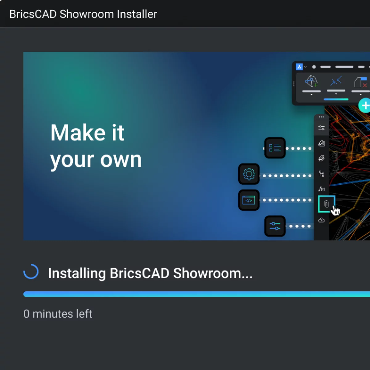
4) Download & Install Flow (For the trial and full version).
Why was it needed? The current executable file was very heavy in terms of installers and it was only getting heavier: to the point that some Operating Systems would detect it as malware. Terrible first impression. By modernizing the download and installer, making use of current software practices, we could drastically reduce the size, but also improve the flow to make it more user friendly and intuitive. There was an opportunity as well to use the waiting moment to provide some type of interaction with the user - either to teach about newer features (upsale) or to start configuring the product from the get-go.
Benefits: Ideally, no longer detected as malware. Better first impression. More transparency and guidance in the process. New opportunity to interact with the users to upsell, teach or offer a more personalized experience.
Customer Touchpoint Layer
5) Trial Experience.
Why was it needed? According to usage data, the majority of prospective users were dropping off on the 2nd day of the 30-day trial, the rest following between the 7th and 10th day. I discovered through user interviews that this had two reasons: 1) Users didn't really test anything in the trial, because to deem a software viable they usually tested it alongside their current software in a project. Our users' CAD software projects would range from 6 months to multiple years. And 2) The trial experience was actually a modified full level license with only 30-day validity; it did not offer any guidance or support to new-coming users, and it only bother existing users, as it was reported that if you had an existing paid license of older versions (or if you bought the new one) the modified trial license would conflict with the versions and create technical problems for the user.
Benefits: Solve the technical conflicts of licenses. A closer testing experience to what users need. Opportunity to get better trial data (if stand-alone). A more focused end-to-end that would let the organization help users experience and test the software more efficiently.
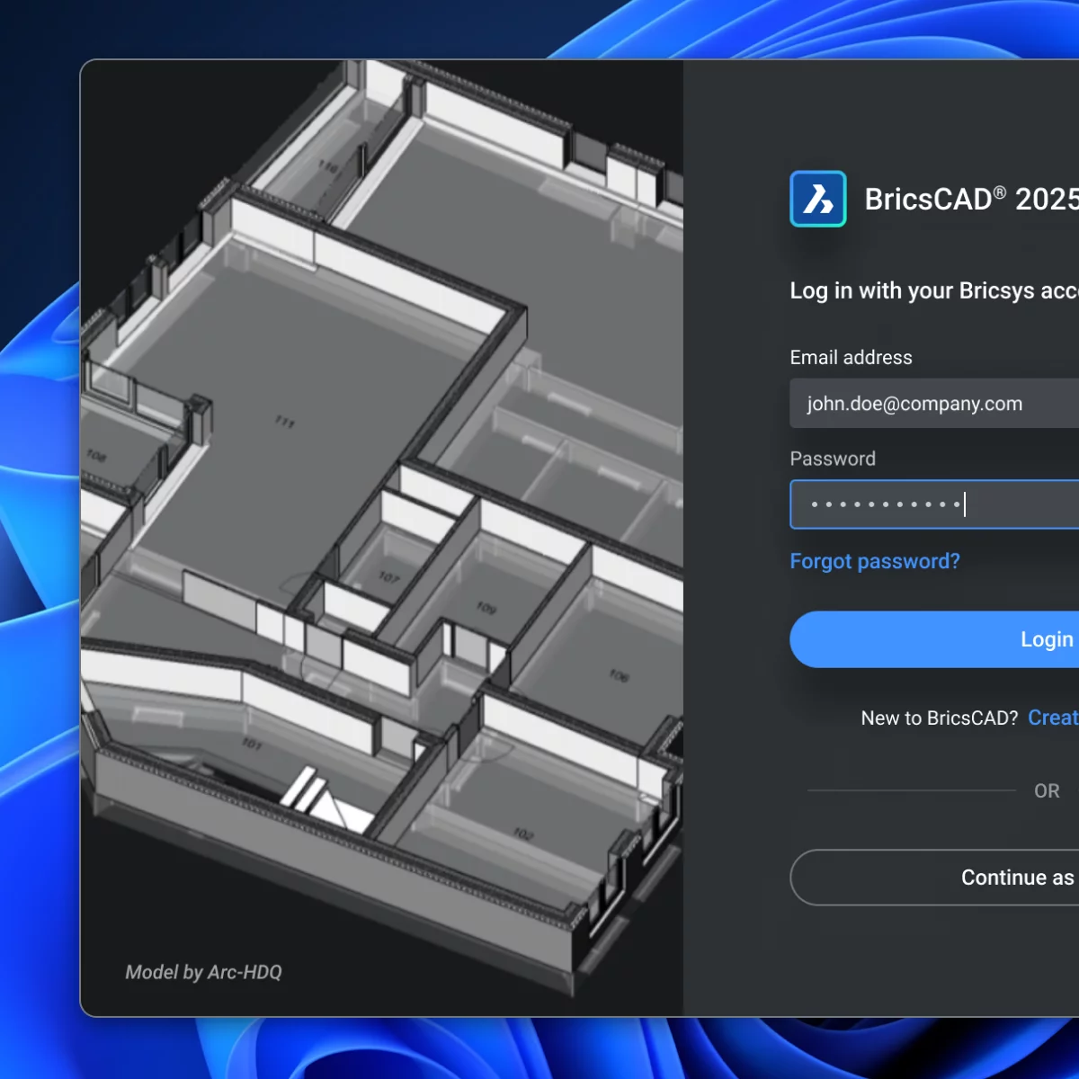
6) Onboarding Flow (Registering, Purchasing, Activating, Launching for the first time).
Why was it needed? For new-coming users the process was really involved and the pay-off was rather lacking. A lot of unnecessary information was required upfront to register - some even outdated or plainly irrelevant for certain types of users. All of this blocked purchasing, downloading, activating and launching. A lot of more modern solutions already solved these problems, and our users were already expecting a similar experience. Furthermore, with a carefully crafted onboarding flow, the product could already start tailoring the configurations and offerings to what the user needs - making it a more personalized back-and-forth experience.
Benefits: Reduce friction in the first step of the customer journey. Use the opportunity to gather more information and learn more about the needs of the users. Offer a more personalized experience, better impressions for new users.
7) Shopping Cart (and "How to Buy" page on the website).
Why was it needed? Tying it back to the poor communication of the website, the amount of configurations possible to buy a license level made the process quite challenging for users that do not have the entire information clear (which is the majority, based on the average customer journey). A lot of terms are used that are never explained (not even in the website or after buying). Difficulty for users to see what they are adding to the cart or how their choices of license configuration add to the total they are about to pay.
Benefits: More interactivity to see what the choices in license configuration mean to the total price would communicate and reinforce the link between price and features that users are seeking. Improving the shopping cart to reflect the possible new packaging of the product would make for a much cleaner and straightforward experience for the user. Less friction = higher possiblity of finishing the purchase flow. Eventually, there could be a low commitment flow in the website that could help the user land on the version most suited to their needs and save them a lot of research and guesswork.
8) License management (After-sales and user administration).
Why was it needed? More than 500 support tickets in the last version referenced "problems" with activating, moving or deleting licenses. The system itself was very outdated and prone to irreversible errors that required the user to seek help from the support staff. A clear example of this: users trying to install the software that they own (legitimate license) in their new device but not being able because they never "released" the license before (a flow that is never communicated prior and utterly outdated). This requirements closely ties with the trial license conflicting with existing licenses. And finally, because during the research and exploration, I found a key vulnerability in the license system that made the company lose revenue (that initiative is for another story). Regarding team licenses, the system to keep track of those was extremely clunky (console based, not even a visual UI). A lot of team leaders were holding off because even though they liked the product, they could not manage the team license without active help from support.
Benefits: Taking advantage of newer license management systems that contemplate users current need would mean less support tickets. Solving a key vulnerability. Finally, offering modern capabilities for team leaders to track their team licenses would turn a weakness into a strong selling point for the product and thus an attractive revenue opportunity.
As you can see, by this point, I had a general sense of every improvement that I had to carry out to fix the problems. Still, for this to work and make sense, I had to carefully plan and orchestrate how and when each of these elements would be designed, developed, and introduced to the user.
There is no use in changing only the trial experience, for instance, if the licenses communicated are still incorrect and do not reflect the actual architecture of the product. Hard blockers like this started popping up all over my exploration, and with only one big release per year, a little nudge in the right direction was not enough to make a dent in the problem. Knew it from first-hand experience.
Considering the lack of development resources to tackle this huge endeavour all at once, and constrained by the 1-year release cycle, I had to be very careful with the planning and prioritization of the proposed improvements. The goal was to implement a systemic solution that brings more value to the users than before and solves the organization’s problems.
There was a lot of potential for unforeseen consequences and poor adoption of the solution, given the fact that I was going to tackle core systems. Incorrect, but established nonetheless. To minimize risk, I ensured that the most disruptive changes had ample room to be tested and iterated upon. This also worked in my favour, as the most disruptive changes were the ones that informed the most decisions in later stages.
Finally, to make sure that the solution would remain solid in time, it had to be adopted across the organization. That meant a significant culture change, and that is when I realized I needed a clear vision to gather a following, and I needed to involve most (if not all) leadership. With enough momentum, the idea would move on its own, but for now, I could use the Naming Document to attract sponsors.
After a lot of devising on how to correctly solve myriad of problems, and finding myself navigating a lot of internal political pushback, lack of leadership guidance, and an overall lacking strategy for the product and User Experience, I took ownership and created my own.
During my research and exploration, I discovered a key principle that, although seemingly obvious to some, proved invaluable in maintaining the focus of the improvements. In the overall user journey (both new and existing), we were tackling everything around a moment in which the user has to make a decision (either to buy or upgrade) based on a multitude of factors. The core tenet of my strategy was that even if we manage to do everything right and communicate everything without noise, the end decision that we are trying to influence rests on the user, and so is out of our control. What we can control, however, is everything that we show and how the user interacts with it.
Strategy: Stack the odds in our favour. Within a year, and without adding new features, re-order the entire discovery and learning experience (the first impressions) of the product, so we can properly immerse, show, and teach the prospective and existing users about the benefits of the product - effectively putting our best self forward to be top of mind at the moment of a buy or upgrade decision.
Together with the strategy, I prioritized every improvement based on Effort (the resources required to build - design, development, time) and Impact (how critical the improvement was for the systemic solution, how much its development contributed to the development of the other improvements, and how much information it would provide for further developments). I arranged each of them in a roadmap spanning an entire year, focusing on rolling out changes sequentially and building upon the last, both in the product and in the organization. In this story, I will focus on two of the most important and significant improvements designed:
Naming Document
What was it? It was the document containing all the definitions of the key entities on our platform. It defined what exactly a “product” was in our line of software. It defined how a user could access products - no longer through licenses, but through “access passes,” also described in the document. It went on to define every type of attribute that an access pass can have, as well as to which “module” it grants access. (Some drafts can be found in the gallery.)
How did I build it? Simple, I went back to the dictionary. Most of it was driven by common sense backed by terminology that the majority of our users were familiar with (either because of a competitor or because a term was well-known but not yet properly defined). Whenever confusion came, I opted for a new name - a blank slate with no baggage, mental models, or anything previously learned by our users. This was simultaneously the most and least intensive UX work I have done, but I soon discovered the power of naming.
Favourite part? Three things: First, it became my favourite thing to work on, because I could see the impact a single word had on the entire platform. Second, once I got it to a working state, I brought in other leader and experts from the different verticals of the product to iterate on the document, and that gave me the most enriching professional conversations of the last half of my career, plus I could see how the idea was gaining momentum, as more and more people became involved in shaping this foundational piece. And lastly, it outgrew me. As I left the company a year after this initiative, I kept in touch with the people in the organization, and they have told me that the document is still being used to guide many of the changes that have happened since I left.
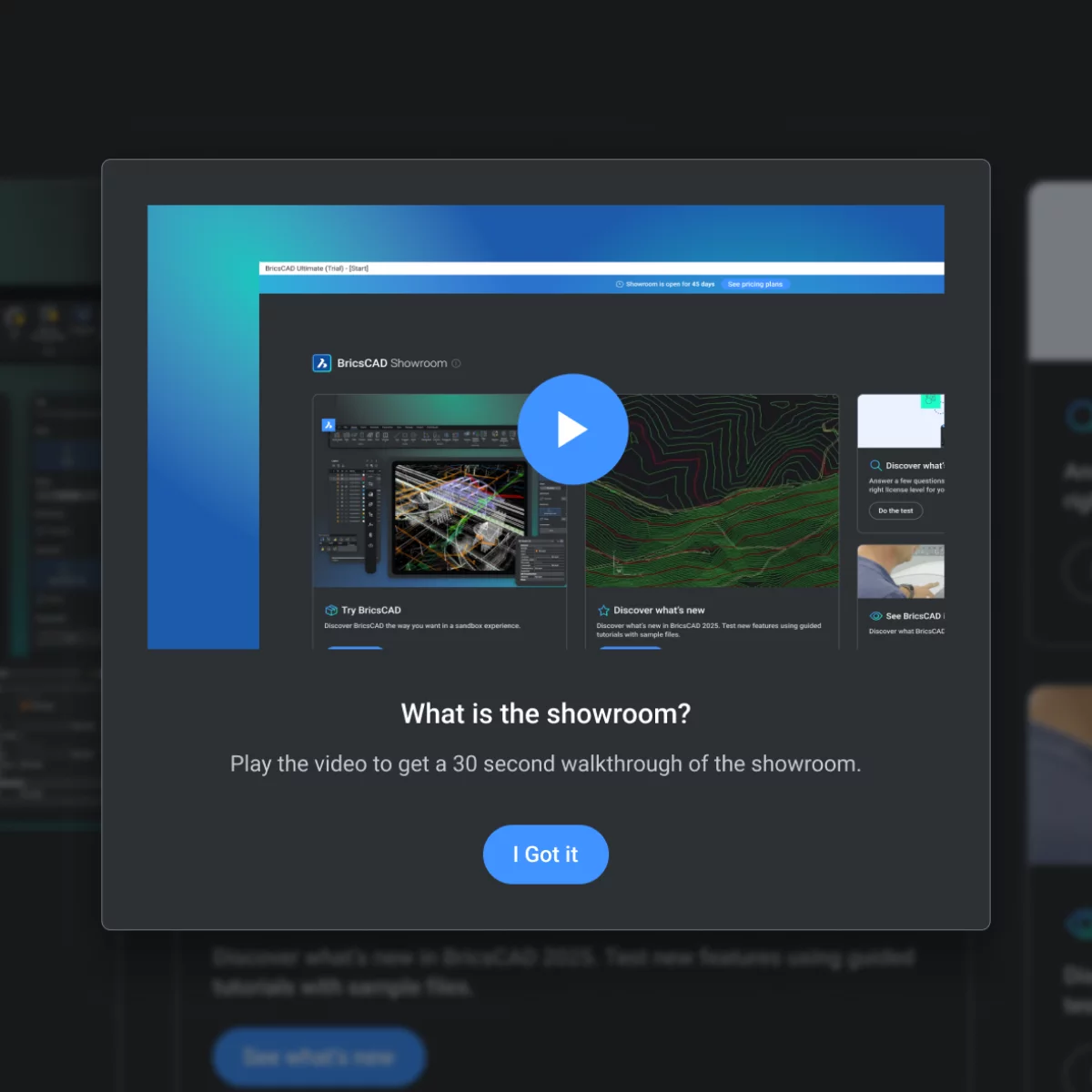
The Showroom.
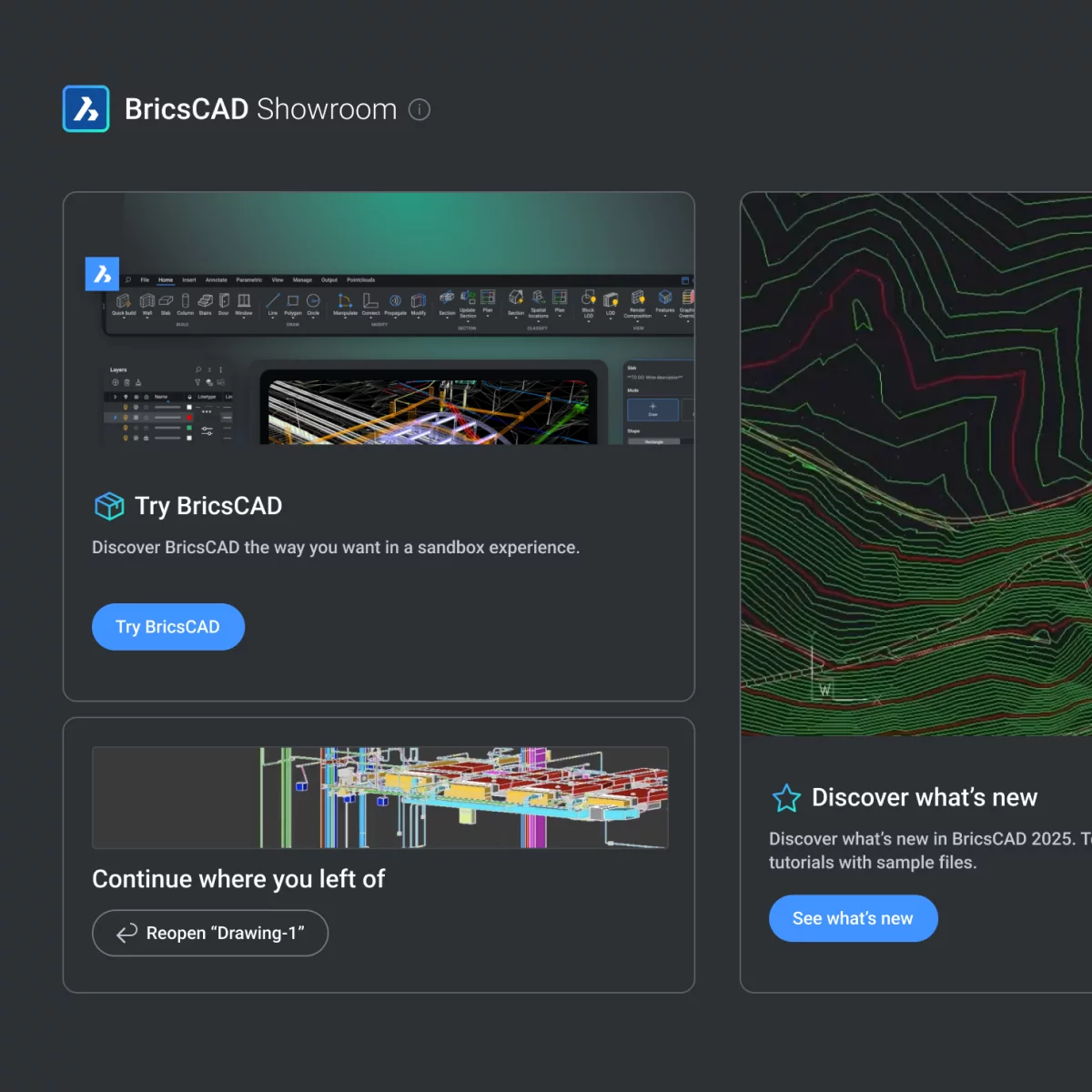
What was it? The Showroom (and its lightweight download and installer) is the new proposed standalone trial experience, better suited to meet the needs of our users. It is no longer only a sandbox; it is a guided experience. It has a beginning, a middle, and an end. It is no longer a 30-day full license modification; instead, it has its own license now. Users use a Showroom access pass to download the trial. Right from the start, users can opt not to log in to an account to test the software. A lower barrier of entry, paired with the lightweight installer (designed not to be detected as malware and easily shareable over Slack), makes this an experience that requires significantly less time commitment upfront. Once in the software, the program will provide a brief explanation (for those who are interested) about what The Showroom is and how it works. It is mainly split into three main pillars: 1) The sandbox mode (like the old, but with a twist), 2) The new features mode, and 3) “See BricsCAD in Action” mode. Each mode represents the type of testing, or more like, the types of questions and doubts that our users initially have when facing the buying or upgrading decision: “Can this software do what I need it to do for my project?” And so they test. At any point during the Showroom’s duration, a user can take a quick quiz to find their recommended licenses based on their needs and expertise. If the user did not do that at any point, a recommendation will be provided at the end of The Showroom, based on all the tools used in the trial experience, along with a direct link to the pricing page.
Favourite part? I have two. During user interviews, I learned that users are quite reluctant to upload their own project files to the program (for security reasons), but this is a key aspect of a CAD program’s feasibility - specifically, how well they handle files and what types of files they support. One of BricsCAD’s USPs is that it can open almost every kind of file relevant to the CAD world, but sadly, this is not very well communicated. In the Sandbox mode, I opted for a cheeky, almost defiant UX Copy prompting the users to try and open any file that they are used to working with - see if BricsCAD can handle it. This proved very popular in the initial tests, as these types of users appreciate witty banter and being challenged. On that note, on to my second favourite thing. I chose to extend the available time to test in the trial. From 30 days to 45. Initially, I wanted more, but it is a difficult argument, and so I settled for it. I knew from the data that the dropoff in usage is immediate, and so it didn’t matter that users could test more days (even if it was closer to their needed range), if they were going to leave. The solution I came up with gave me the best of both worlds. I introduced three secret tasks to perform in The Showroom (gamification patterns) that would add bonus days to the total duration. One task at the beginning, one around the middle, and one close to the end. In essence, the first one was going to be almost a given - letting the user earn easily 5 more days of testing. Without any hint or anything, users who appreciate the challenge would want to find the remaining tasks. If all the tasks were completed, The Showroom would last a total of 60 days. Almost 3 months of working time - a measure of time that is much, much closer to what users need to test alongside a real project.
TL;DR
Strategy:
Stack the odds in our favour. Within a year, and without adding new features, re-order the entire discovery and learning experience (the first impressions) of the product, so we can properly immerse, show, and teach the prospective and existing users about the benefits of the product - effectively putting our best self forward to be top of mind at the moment of a buy or upgrade decision.
Solution(s):
Create a Naming Document with every definition, to work as a single source of truth. Rework the product packaging (License levels, included features, pricing, etc). Improve Website Communications (Licenses, Features, Pricing). Improve the Download & Install Flow (For the Trial Experience and the Full Software). Improve the Trial Experience. Improve Onboarding Flow (Registering, Purchasing, Activating, Launching for the first time). Improve the shopping cart and add a ‘How to Buy’ section to the website. Improve License Management (After-sales and user administration).
Outcome & Impact
Delivery and Measured Results
The initiative was carried out up until the fourth quarter as I remained with the company. All proposed documents, designs and prototypes were delivered on-time according to the planned roadmap.
Qualitative testing was done for all delivered designs. Of note was the new Onboarding flow design (including Download and Trial) & The Showroom which garnered 100% user satisfaction in all tests. Many users praised the modern look and ease-of-use.
In terms of Quantitative metrics, the only tested improvement was the stand-alone trial experience (as it was going to be the first to be released). During the Beta release, The Showroom showed a 20% conversion rate. That is a 18% point increase than the last conversion rate measured.
Impact in company culture
I was happy to see how the initiative gained momentum as soon as I started showing the work and involving the sponsors. They were key players in moving the initiative forward. The culture was not ready before. I had to approach leadership three times with my research before I got the green light for the initiative, and even then it was not with much support. After the initiative was released, and most of the organization knew about the work being carried out, a lot more vertical leaders started voicing deep seated problems in the platform, with the intention of fixing it. A lot more teams were discussing the things that they were building with one another. The effect of the Naming Document, and the proper definition of the product packaging brought, also, a lot of visibility on the effort versus return in terms of development. For some teams that was really eye-opening, but in the end more transparent, and that helps reduce confusion.
New business opportunities
The initiative drew attention on an overlooked market but quite profitable market within our user base. Normally, the driving force of the revenue was the B2B sales, but there was an argument to be made for smaller teams or individual professionals and freelancer buying the product for their own work. Learning that the website, shopping cart and onboarding were poorly optimized, meant that it is a real possibility that the company was "leaving money on the table" by not catering to that revenue stream. The other business opportunity came in the form of the Team Admin platform. That was only in design phase by the time I concluded my time with the initiative, but I received praise from leadership as it was a very interesting concept to develop into an upselling revenue stream.
Personal growth - Certified Strategist.
My biggest hurdle in the initiative was navigating the political and social landscape of carrying out an idea. I did have my fair share of mistakes and things that looking back, I would do differently, but one thing that this initiative inspired me, was to pursue a more formal training in the Strategic aspect of User Experience Design. Today, I am a certified UX Designer thanks to the wonderful mentors at NN/g, and I think that was born out of the challenges that I faced while trying to Stack the odds in our favour.
TL;DR
Outcome:
18% point increase in conversion rates and 100% user satisfaction in the deployed solutions. On-time delivery of implementations according to the roadmap, aligned with the Strategy.
Impact:
Teams were aware of each other's efforts. New visibility on product packaging meant more accurate visibility on development efforts vs return. More incentive to cater to smaller teams and single users through e-commerce, as new improvements revealed a business opportunity in an overlooked market. Personally, learned a lot about influencing product strategy in a cross-team endeavour. Enhanced my skill set and became a certified UX Strategist afterward.
Gallery